Are Your Business Cards Costing You Business?
It may seem like an odd question “are your business cards costing you business?” Yet, I see so many interior designer cards that are poorly branded, cheaply produced, badly designed, and even missing key information (like an email address.) Your business card is that tiny, tangible piece of your brand that has a powerful and potentially profitable impact.
What kind of reaction do you get from someone when presenting your card? Do they just take it and stash it in their wallet or purse immediately? Or do they examine the card because of it’s weight, it’s color, it’s design, and it’s impact? The latter reaction is what you’re looking for.
In the age of social media it’s easy to think that business cards don’t matter. If that’s true then why do we still carry them? They matter, a lot. Yours needs to stand out and make you memorable and worthy of working with. In fact, your business card can make the difference between you being considered for a plum project or you being ignored. OUCH!
The Point of Your Business Card
Let’s answer the questions here “are your business cards costing you business?” Compare your business card (go on, pull yours out right now) to the list of criteria here and see how you measure up. The point to your card is to drive the recipient to your website, to your social media, to engage with you and create meaningful interaction that leads to profitable business. That may be a project, it may be an interview for a publication, it may be a brand ambassadorship (bet you didn’t see that coming, did you!)
A Logo or No Logo?
This is a choice, I’ve flown without an actual logo beyond my signature for many years, it works for me. I’ve also known designers who get trapped in designing a logo for months and never get their card done. DONE BEATS PERFECT! Oh and remember, you’re an interior designer, stay in your lane of genius. Hire a graphic designer for your logo and cards and a website designer for your website. If you are starting out, you can leverage low cost resources like those I highlight in our FB group, come join us!
Photo or No Photo?
If you use a personal photo, you have to LOOK LIKE THE PHOTO. That means if you change your hair style or color, you need new cards. If you age, and we all do, you need a new card. There is nothing sadder than someone presenting a card with a picture that is clearly 5 years younger or more. In design, you’re interiors are more important than you. If you want a picture of you, I recommend you show it in an interior you’ve designed.
If you use a design image be sure it is one that won’t be out of date soon. Some designs look out of date faster than others. And if you really want to have some fun, explore one of my favorite sites for killer cards and use their Printfinity. This allows you a different image on the back of every card which could be a lot of fun if you have a large portfolio you are proud of.
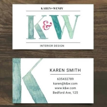
Good looking design, can lose the www. at URL, and replace location with social media. Most interior designers work locally and long distance.
Essential Information
You must have the following on your card:
- Your Full Name (certifications if you have them)
- Your Title (CEO & Founder, Principal Designer, Lead Designer, Designer Director NOT Owner)
- Your Phone Number
- Your Email Address (SEE RANT BELOW on this)
- Your Website URL (no www. is necessary it’s assumed)
- Your Social Media Icons (no more than 3)
Your Email Address is Killing Your Business
In today’s digital age this is possibly the biggest reason you carry a card, to provide your email address. And yet, on average, out of 100 interior designer’s cards I see, only 10 cards have a well branded email address. The first place we all look BEFORE opening an email is to see where it came from, a well branded email address gets opened faster and sets an expectation of professionalism.
Specifically you want your email address to be yourname@yourbusinessname.com For example, I have both melissa@173.254.10.202 for speaking, training, and coaching and melissa@melissagaltinteriors.com for interior design.
Do not market for the big brands like gmail, hotmail, yahoo (makes you a real yahoo), msn, or anyone else. Yes, both of mine are gmail addresses and go to a single email account (I don’t have time to check multiple accounts.) Get your tech to set this up. If you don’t have a tech, FIND ONE!
It’s tacky to use ameliasinteriors@gmail.com or susansmithsinteriordesigns@yahoo.com.
And if you’ve been defaulting to info@ameliasinteriors.com that’s no less inviting. Do you want to email an “info” box instead of human being? Of course not. Design is personal, make it so.
If you refuse to use a name, then at least get something chic and upscale like concierge@ameliasinteriors.com or clientcare@ameliasinteriors.com, where the sender feels they will be well received and replied to.
NON-Essential Information (Otherwise Known As JUNK on Your Card)
- Your Fax Number (while you may have vendors faxing, clients don’t need this)
- Your Mailing Address (unless you have a storefront or open studio where clients meet you, you don’t need an address on your card)
If you are going to furniture market, High Point, Las Vegas, NYC or any other, take market cards with you that include vendor necessary information like your ship to, fax (some vendors are still in the dark ages), and even license numbers. These cards are strictly for market and can be printed more cost effectively because they aren’t intended to market your business, they are intended to inform vendors.
Social Media on Your Card
First make this easy, use your business name across all channels so that a simple @yourbusinessname is the same and you can use attractive logos for each channel instead of needing long and messy handles. I’m @melissagalt on every channel. It includes design and coaching, it was a calculated risk. I’m one woman with two related hats, it works.
In your case, I’d expect to see @ameliasinteriors or simply an icon for Instagram, Facebook, and maybe LinkedIn. G+ is either already shut down or about to be. While you may be on Twitter, it’s unlikely you’re getting clients there, don’t include it. Be where you’re clients are.
Less is more on your card.
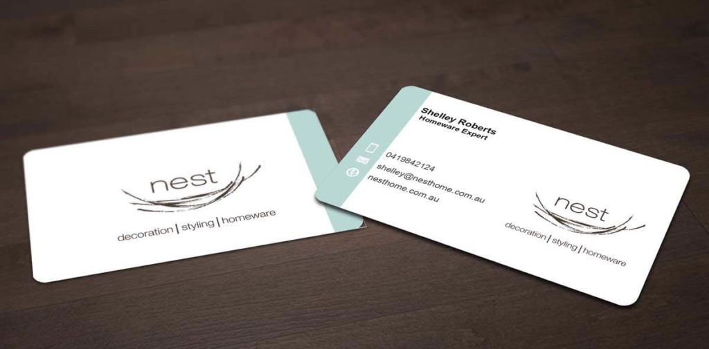
Simple, clean, clear design. Still missing social media, it matters.
Tag Line or No Tag Line
I’m a fan of tag lines when they are well thought out and don’t sound like something 100 other interior designers have on their card. If it isn’t original just skip it. Tag lines tell the card holder, at a glance, what your business stands for. They should be copyrighted if you’re serious about building a business with it. And it should also appear on your website and in the headers of all of your social media.
Glossy or Matte
Glossy cards tend to look cheap, show fingerprints, and are entirely unable to accept any notes, stick with matte.
Save the Best for the Back
Never allow the back of your card to be blank, that’s lost real estate. If you have nothing else to put there, or want to stop a potential client in their tracks, include a juicy testimonial or portion of one (don’t overcrowd.) Social proof is today’s transparent currency and can tip a potential client over into working with you.
Where to Get Your Cards Made?
I’ve used Moo for decades and always been thrilled with the outcome. I also get a lot of positive response to my cards, they create conversation, engagement and make me memorable. CLICK HERE for a discount with them.
For market cards, strictly for vendors and suppliers, I’ll use VistaPrint because it can be more cost effective. I never do “free” cards that say “vistaprint” on the back, that’s tacky.
And yes, you can find your own printer online or offline, these two have tons of templates so if you don’t want to invest in a graphic designer you don’t have to and can still look well branded. Yes, your business cards, note cards, website and all marketing materials should look like it came from the same collection, that’s the definition of branded.
So how did you do comparing you’re card to the criteria here? Is a new card in order?
Love to hear from you in the comments below or in our Facebook Group exclusively to the trade.

